 STRIVESOCK
Customer Background
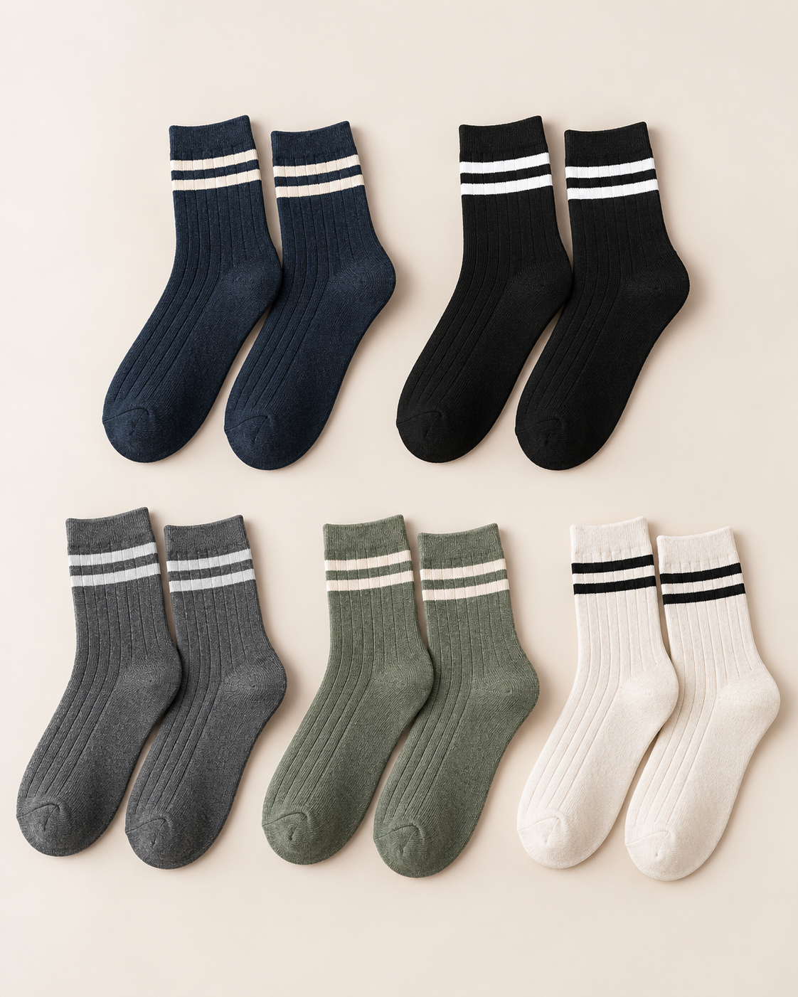
Our client is a European lifestyle boutique retailer offering a curated selection of apparel and accessories to design-conscious customers. As the business expanded its private-label assortment, the buyer wanted a private label lifestyle sock collection that could sit naturally alongside its existing clothing range.
The initial idea sounded straightforward: use established brand colors, apply them to classic crew silhouettes, add subtle branding and prepare the products for retail. But once the project moved from digital artwork to physical yarn and knitted samples, color became one of the most important development decisions. The goal was not simply to produce several different colored socks; the final range had to look like one coordinated collection.
The Initial Product Direction
The retailer supplied existing color references, logo artwork, stripe ideas and examples from its apparel range. Two lifestyle directions shaped the first sock range: retro-inspired crews with contrast stripes and a nostalgic sportswear feel, and varsity-inspired crews with cleaner branding and more understated color combinations. For a similar starting point, compare Retro Sport 01 and Varsity Crew 01 within our private label crew socks range.
The initial palette included neutrals and seasonal tones such as cream, navy, grey, burgundy, forest green and muted blue. At the artwork stage, the combinations looked coordinated. The first physical samples told a different story.
Challenge 1: Screen Colors Did Not Translate Directly Into Yarn
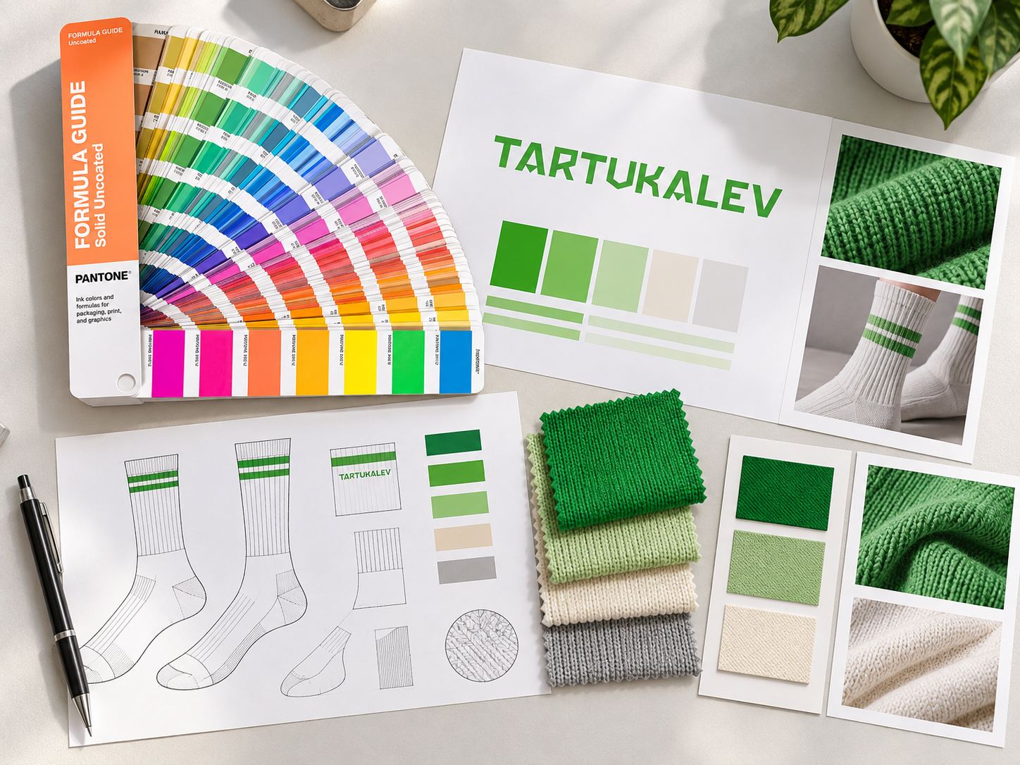
One of the first issues appeared with cream and burgundy. The cream in the digital artwork looked soft and neutral; the first knitted yarn appeared warmer and more yellow than expected. Burgundy looked rich in the design file but darker and heavier once knitted. That mattered because the socks would be displayed beside existing apparel. A color acceptable on its own could still look wrong in the wider collection.
Rather than approve colors from digital artwork alone, we compared alternative physical yarn references against the retailer's brand direction and used revised yarns for the next sample round.
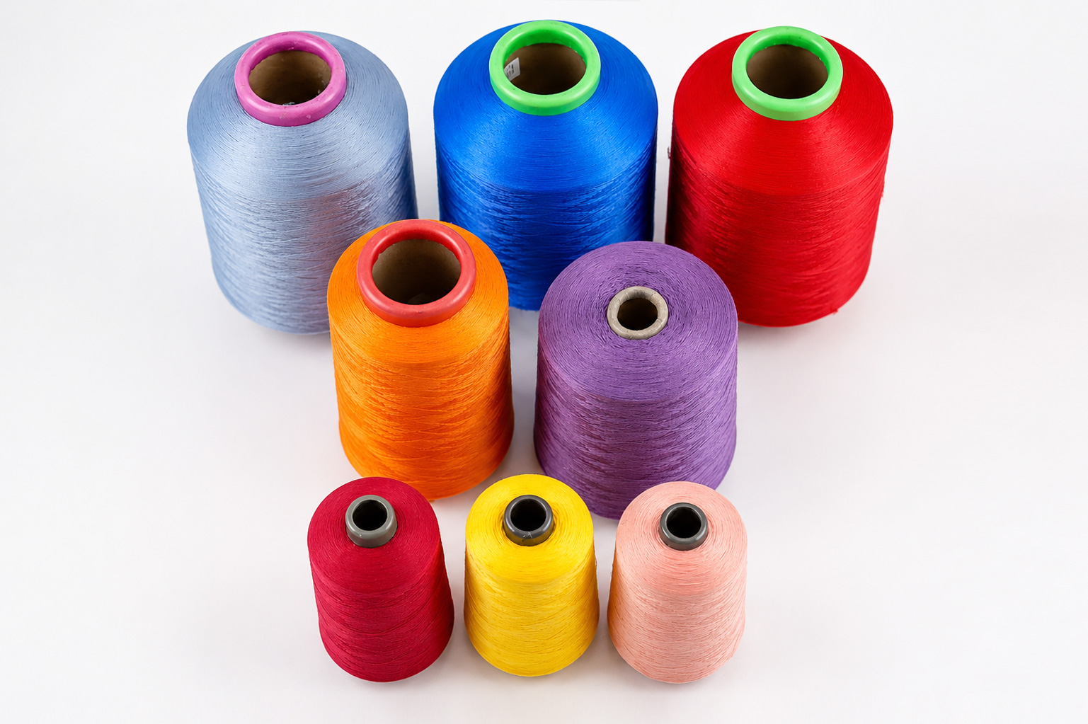
Want to evaluate yarn colors and construction before committing to a collection? Request Sample Kit →
Challenge 2: Too Many Colors Weakened the Collection
The original brief offered a relatively wide range of colors. Most worked individually, but together the first samples felt like separate products rather than a coherent retail range. Competing accents weakened the retailer's identity.
We reviewed the samples as a group and simplified the palette. Core shades such as cream, navy and grey provided continuity; seasonal accents supplied variety without overwhelming the range. The buyer could now evaluate a collection rather than approve each sock in isolation.
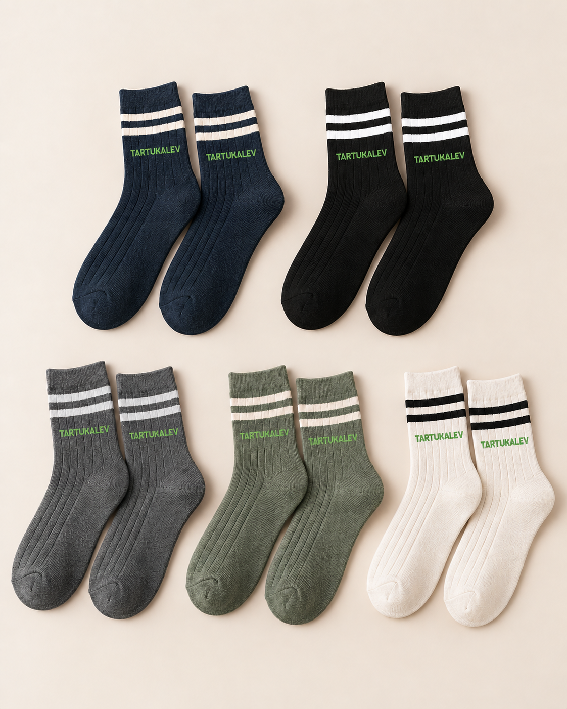
For a broader assortment, a coordinated group of proven silhouettes is easier to plan than unrelated colors. Explore Lifestyle Styles →
Challenge 3: The Stripe Contrast Was Too Subtle
One lighter retro-inspired sample paired a cream base with a very soft stripe. It looked refined in artwork, but after knitting the colors were too close and the stripe almost disappeared at a normal viewing distance. The issue was the relationship between the yarn colors, not either color in isolation.
The next sample increased the contrast while retaining the retailer's understated aesthetic. The stripe became visible enough to work as a deliberate design detail.
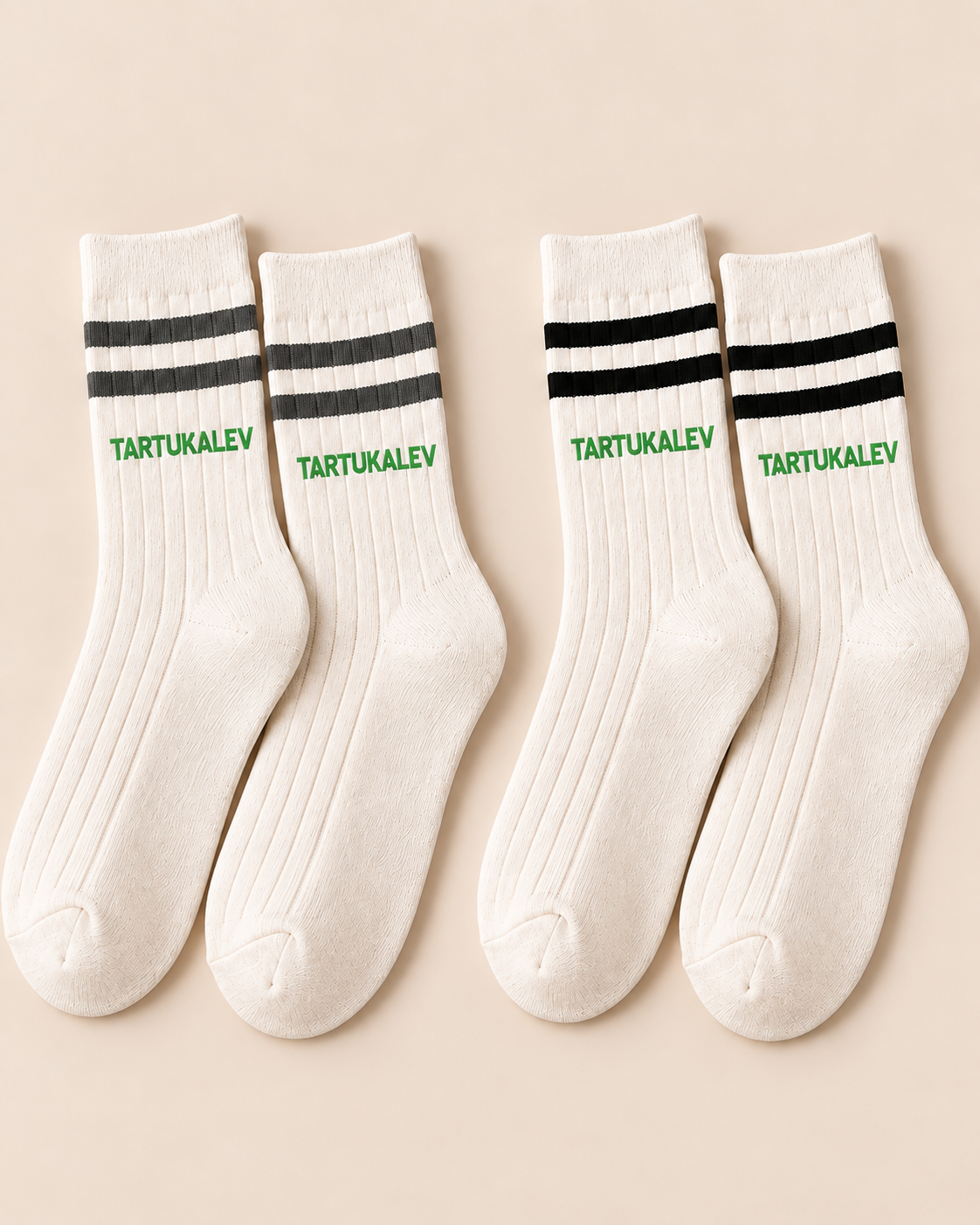
Challenge 4: One Logo Color Did Not Work Across Every Colorway
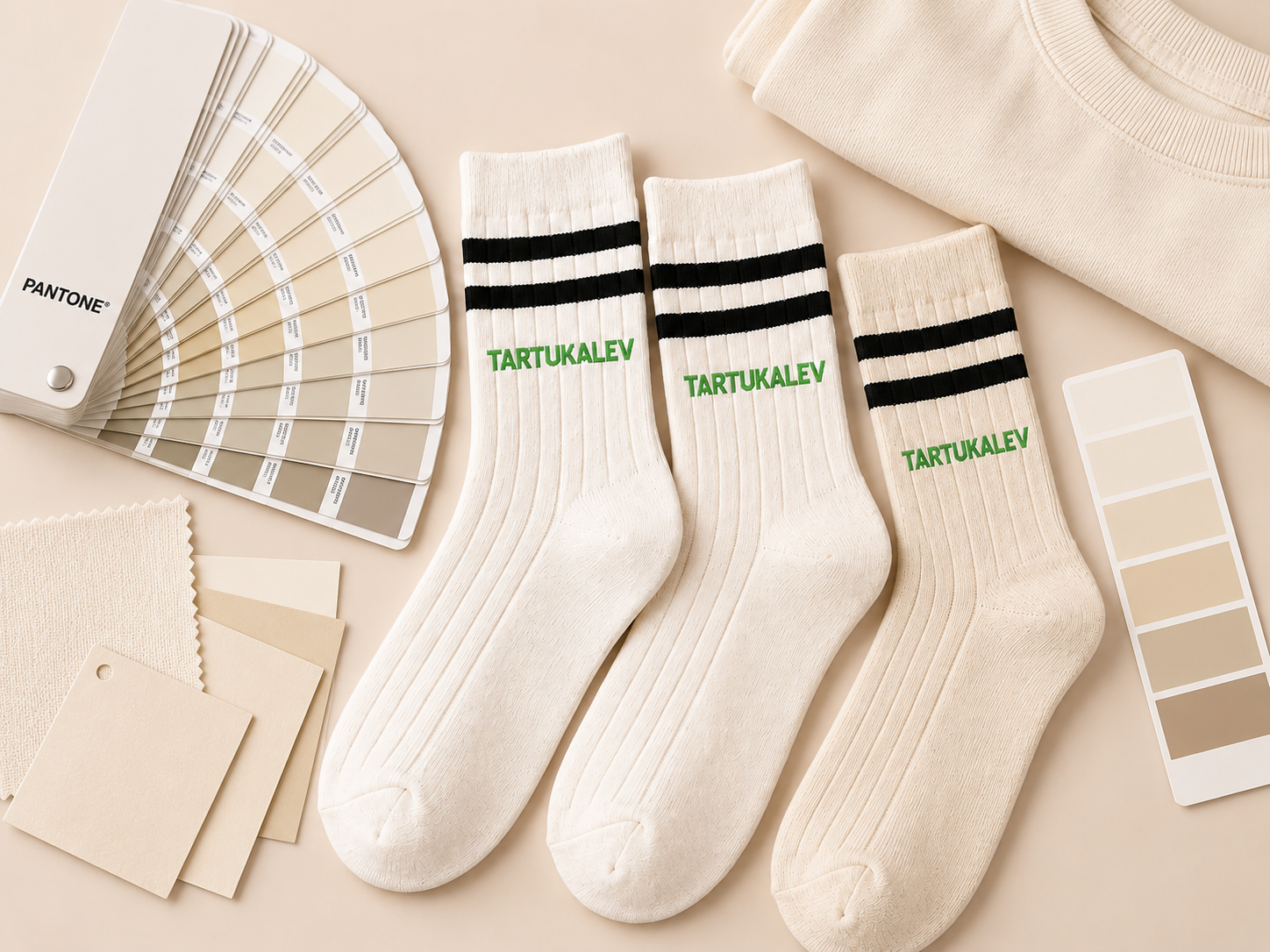
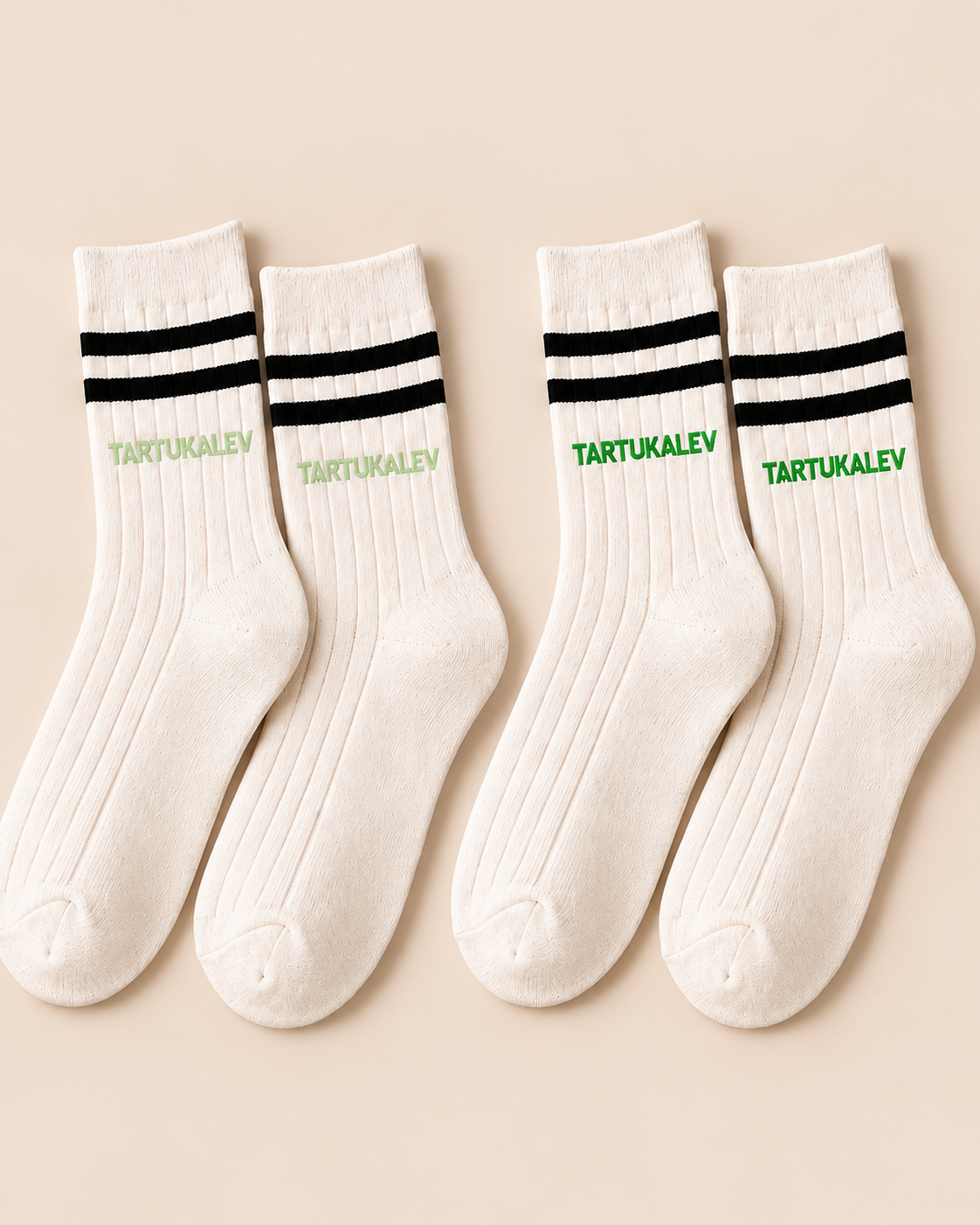
The client initially wanted one logo color throughout the collection. The first samples showed that a light logo worked on darker socks but lost contrast on cream. Rather than change the main sock color, we adjusted the branding system so each base could use an approved logo contrast while still belonging to the same visual family.
Color, stripe and logo combinations can be developed together through Private Label Sock Development; consistency does not require every SKU to use an identical mark color.
Reviewing the First Sample Set
Looking at the complete group, rather than at one sock at a time, exposed the most useful problems: some colors felt too warm, some accents too weak and one logo treatment disappeared on lighter products. Each design was reasonable on screen, but the physical range did not yet have the consistency expected for retail presentation.
The buyer and development team reviewed each sock, each color combination and the collection as a whole. Those three views became the basis for the second sample round.
Colorway Refinement
The revised samples did not require a new sock structure. We adjusted the cream yarn toward a more neutral tone, brought other colors closer to the retailer's apparel direction, increased stripe contrast where needed and changed logo colors for legibility. Secondary colors were removed from the first launch to give the collection a more focused identity.
Each change was modest in isolation; together, they made the second sample set feel more intentional.
From First Samples to an Approved Collection
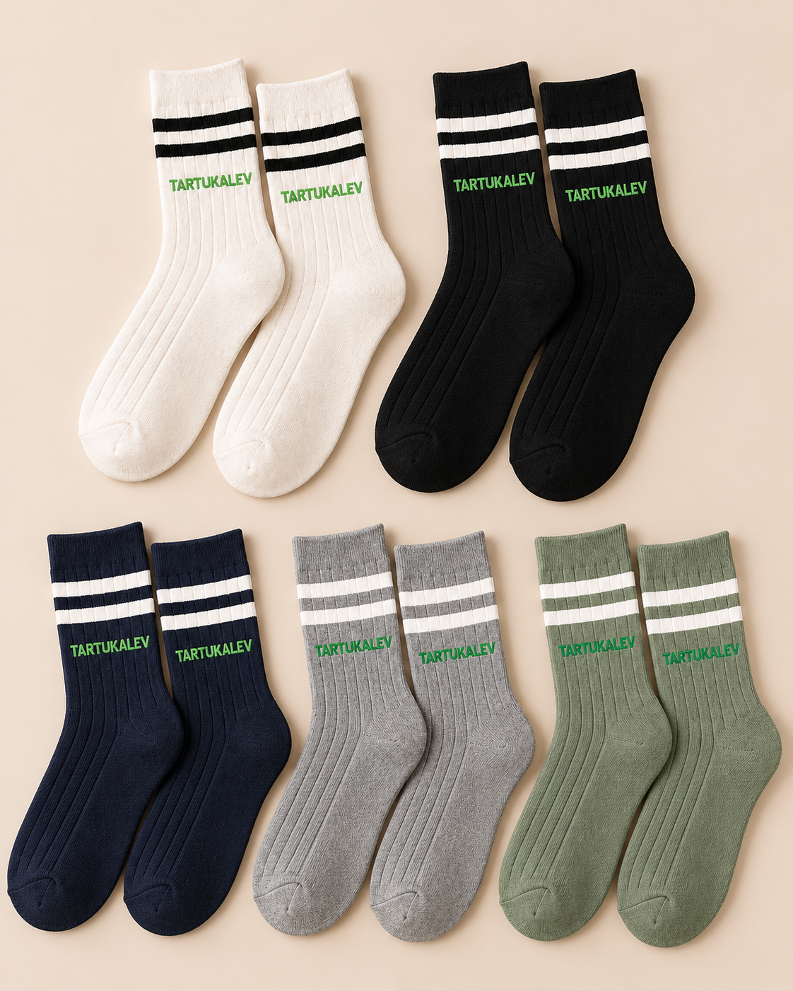
On review, the revised colorways felt connected. Neutral shades created a common base, selected accents added variety, stripes were clearer and logos remained visible. Most importantly, the socks worked both as individual products and as a group the retailer could picture in-store.
Building an Approved Color Library
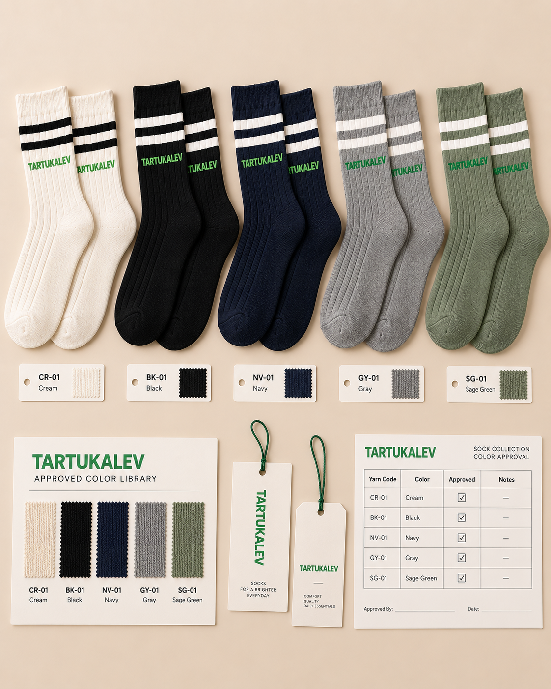
Approval did not end with appearance. Each confirmed version was recorded with its base yarn, stripe yarn, logo color and physical sample reference. This created a color library that both sides could consult for future production and repeat orders, instead of relying on digital color references alone.
Preparing the Collection for Production
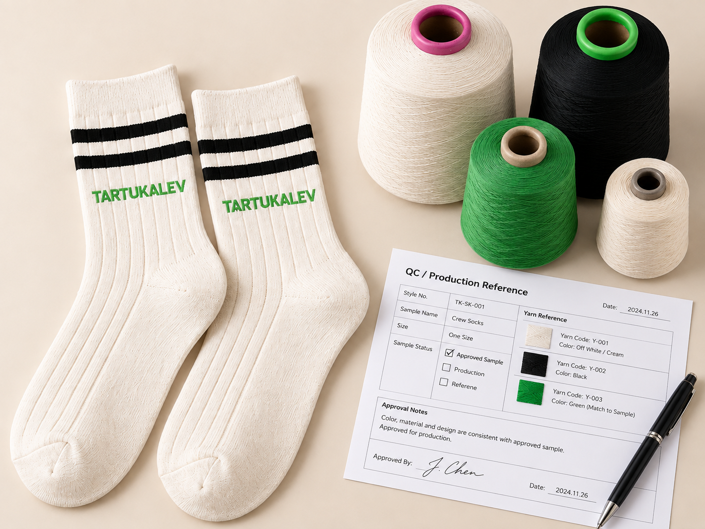
Once the final colorways were approved, the samples became the principal reference for yarn colors, stripe combinations, logo contrast, construction, dimensions, packaging presentation and future consistency. Those details matter especially when several styles and colors enter one range: small deviations can make it look fragmented.
Approved physical references helped align the first production run with the collection the buyer had reviewed. As the range matures, repeat and wholesale supply can follow the same documented product and color specifications.
The Final Result
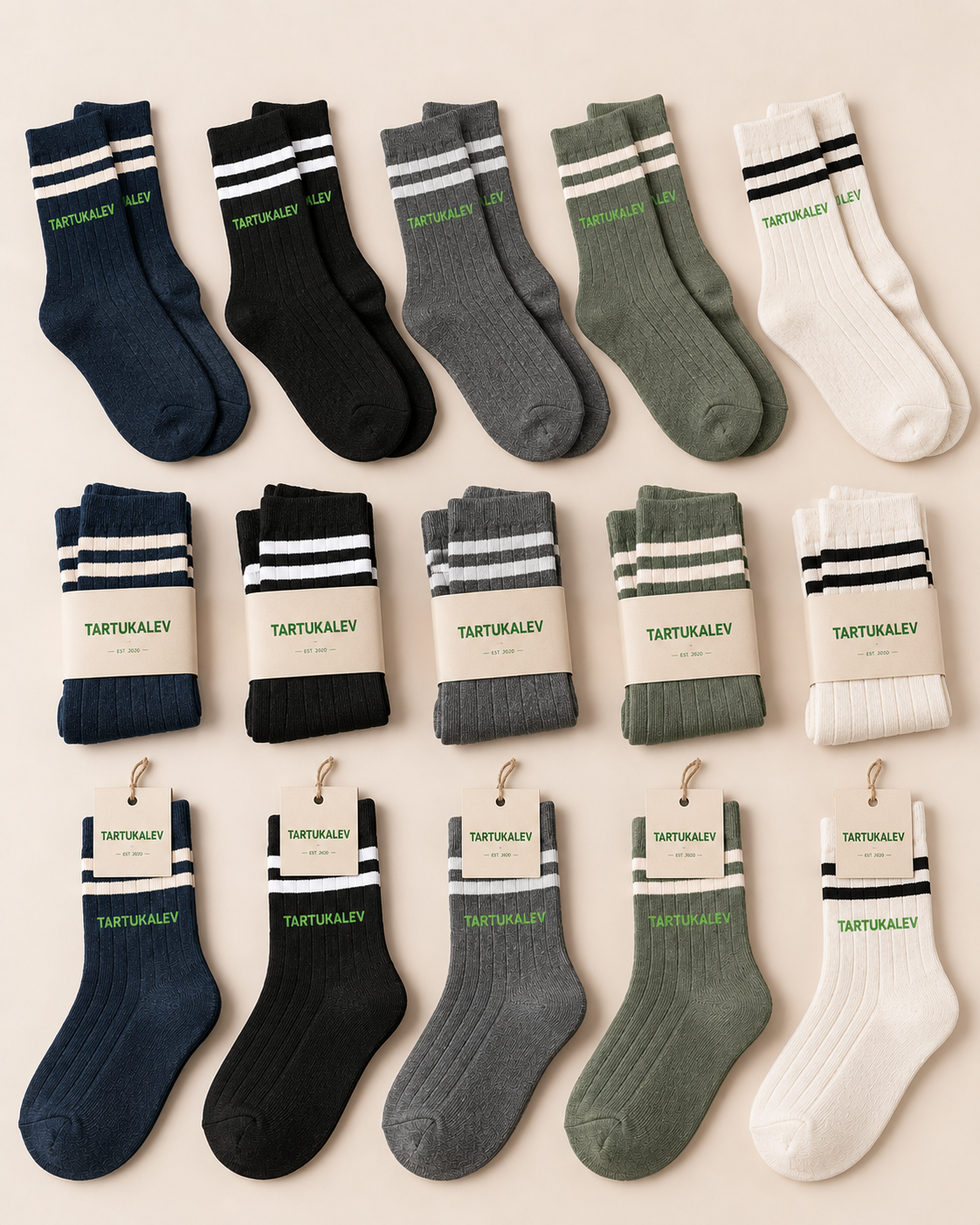
After two rounds of color development, the retailer approved a coordinated lifestyle sock collection for production. Core neutrals and selected seasonal colors gave the buyer several SKUs without losing a common visual identity. The documented color system also made future orders easier to compare with the approved physical samples.
What the Project Demonstrated
Lifestyle sock development involves more than selecting a digital palette. Yarn texture, knitted structure, neighboring colors, stripes and logo contrast change how a color reads on a physical product. A colorway can be attractive alone yet still feel out of place beside the rest of a range. Reviewing the socks together and refining them through physical samples produced a more consistent family before production.
Building Your Own Lifestyle Sock Collection?
Start with your brand colors, logo and preferred silhouettes. If you are still comparing styles and yarn colors, review the physical product first.
Ready to define the range?
Share the palette, styles, branding and quantities you want to develop.
Start Your Project →Still comparing colors?
Review physical styles, yarn colors and construction before deciding.
Request Sample Kit →